Redesigning a Theater Company’s Website
Background
Nashville Improv Company (NIC) is a local theater company that offers corporate entertainment and education.
They have a history of happy corporate clients, but the owner has noticed that, while clicks on their website have gone up in the last few years, the percent of conversions has declined. Until this project, the owner has been solely responsible for website design and feels frustrated with the task of website maintenance.
Feedback from successful corporate events often includes “you were way more professional than I thought you would be” indicating that there are opportunities to improve their website to better reflect their consistent professionalism.
For this project, I interviewed event planners to understand how they plan events and what they think about using Improv in business. I also wanted to know what they expect when they hire an entertainment company. After gathering insights from the interviews, I facilitated brainstorming sessions with the stakeholders before creating a high fidelity prototype, completed user testing, and used those insights to inform key revisions before implementing the final design on their website.
Objectives
Research
-
Where do event organizers search for entertainment for events?
-
What choices are planners aware of for corporate entertainment?
-
Interview Event Planners in NIC’s market to get to the heart of motivation and process when choosing to contact and then hire particular company.
-
Understand the current user experience for the existing design
Methodologies
-
Comparative analysis and exploration of design patterns
-
NIC’s target audience is high end corporate clients with large teams who are looking for a unique form of interactive entertainment or growth-minded team training.
For this study, I spoke with event planners who have booked events with 50+ attendees for high end corporate clientele in the last year.
-
Conversations with key team members to find out what their service looks like, common booking pitfalls, and what they think makes a great class
Secondary Research
Improv training is a niche market, commonly offered for businesses who are looking for workshops that enhance storytelling, team connection, and ideation.
Most improv theater companies offer some form of corporate training, but very few market directly to corporate clients.
Competitors often described WHAT they can do (“teamwork and collaboration”) but users that want an explanation on HOW it’s done are disappointed.
Improv training is all about soft skills like communication, confidence, creativity, and problem solving.
Interviews
NIC’s target audience is high end corporate clients with large teams who are looking for a unique form of interactive entertainment or growth-minded team training.
For this study, I spoke with event planners who have booked events with 50+ attendees for high end corporate clientele in the last year.
When I began this research, my hypothesis was that corporate clients wanted a corporate looking website, complete with official looking forms, and would base their decision on the information on the site combined with reviews and examples of previous work.
During the course of my research, I wanted to understand the typical process an event planner takes when booking entertainment, including how they search, what information they look for on a website, and what leads them to an eventual booking.
Affinity Map
Insights
Event professionals are searching, first by asking for recommendations, then on Google, for things that are unique, innovative, current, and relatable. Google searches commonly include:
Group size: Searches that look like “team building for groups over 100”
Industry specific terms: “sales pitch workshop” or “team building for analysts”
Location specific terms:“Nashville Business Team Building”
Now they need to know if your company is a good fit for their event. Building trust with entertainment is a significant pain point for event planners. Some things that users told me they look for are:
What sense of the company can be felt through their communication with their followers on social media
Examples of brand values and mission in practice
Evidence of their past work like videos and reviews.
Good communication is the number one factor in satisfaction during the booking process.
Event planners expressed wanting a FAQ section so that communication can be limited to specific logistics pertaining to their event.
Difficult or untimely communication will make an event planner avoid using or recommending an entertainment company in the future.
The Journey: Insights along the way
For NIC, success is receiving more inquiries and booking corporate clients- and a key metric that planners describe as successful or painful is communication.
After examining all of the research, I looked for pain points along this journey to discover how we could ease some frustrations and create a great experience for users that visit the site. There’s one emotion that all the event planners had in common during the event planning process…
Overwhelm
What I thought
At the beginning of this research I thought increasing corporate clients might be achieved by making the website look more professional or adding official looking inquiry forms.
How does this apply to Nashville Improv Company?
Due to the unknown nature of improv and theater in general, clients have a lot of questions when it comes to corporate offerings.
They are looking for answers to many of these before they will take the step to inquire about booking for an event.
They know they are going to have to pitch this to their stakeholders to get buy in and theatre workshops are a hard sell.
What I learned
At the beginning of this research I thought increasing corporate clients might be achieved by making the website look more professional or adding official looking inquiry forms.
Words users typically associate with Improv:
making things up
role playing
extroversion
awkward
vulnerable
participation
goofy/silly
high levels of movement
So, what can we do about it?
The antidote to overwhelm is ease
How can we improve the visibility of NIC's corporate booking site?
How can we make commonly asked questions easier to access?
How can we simplify communication?
How can we build trust?
How can we alleviate concerns about theater-based workshops?
After analyzing the research data, I shared the key findings with Lacie, the owner of the business. We then conducted a workshop where we generated ideas for solutions and organized them in a Priority Matrix to decide our next steps based on the research.
Workshopping Solutions:
Brainstorming & Prioritization
After a timed brainstorming session, we worked together to define value and effort as it pertains to Nashville Improv Company. Value being solutions that would directly lead to receiving more inquiries and booking more corporate clients. Effort was a bit harder to nail down. As this is an entertainment company, would effort in this case be defined more as the effort to create a solution or to maintain it? We decided that for the scope of this project, we would define effort as the work needed to create a particular solution.
This workshop resulted in a well prioritized solution matrix agreed upon by the stakeholder and myself, having discussed and weighed the merits of each.
Design
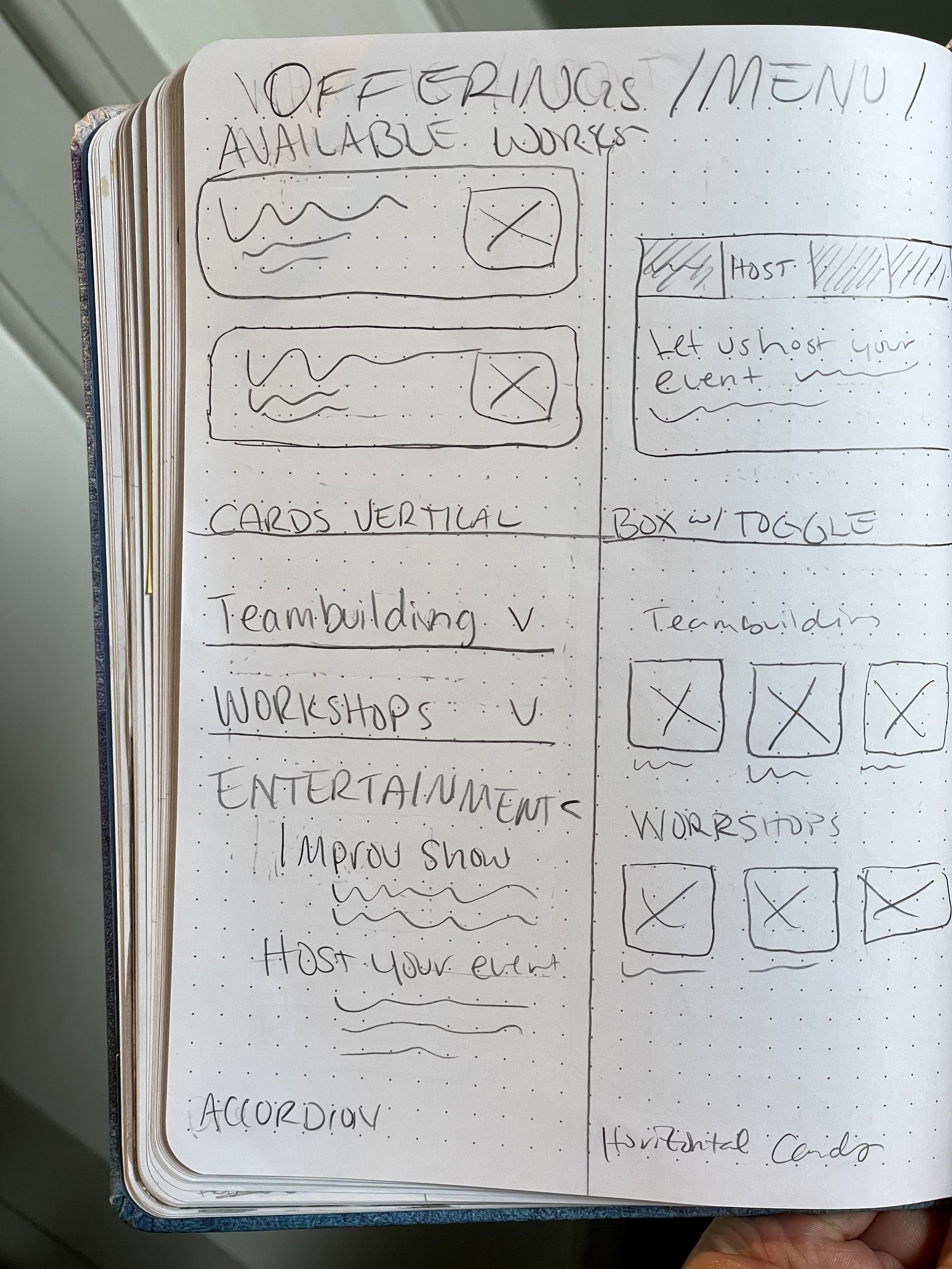
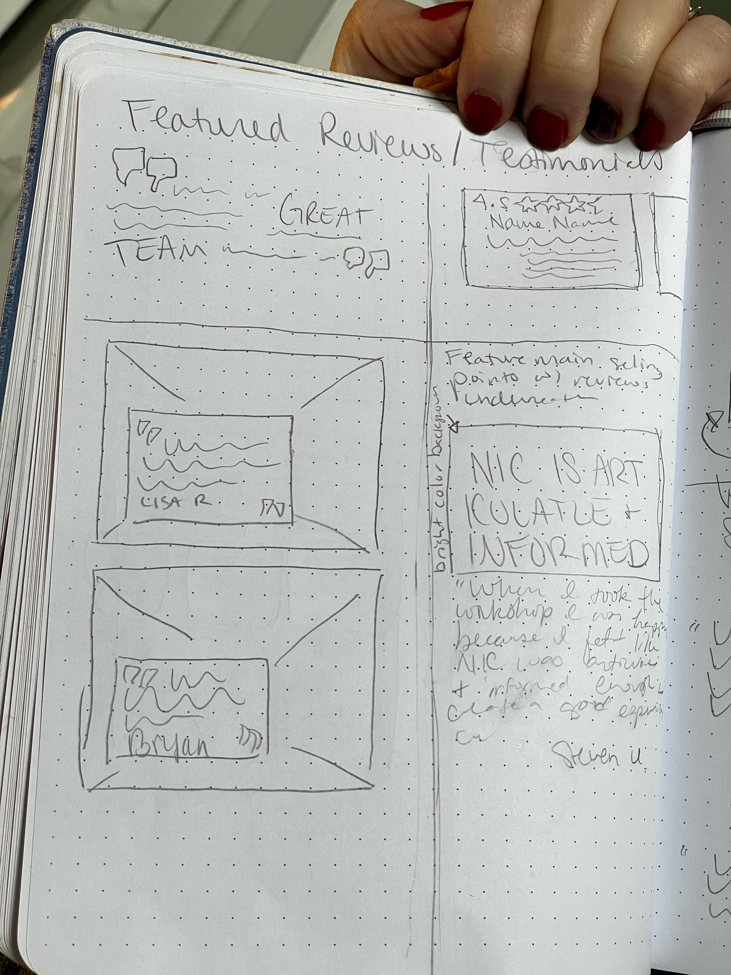
In our "Do It Now" section, one suggestion for the business is to announce their products, customized training, and entertainment during their shows. The rest of the tasks are related to my work on this project, which involves redesigning their corporate website. To start, I made a list of the information I wanted to include on the page, and then divided it into sections to make it easier to understand. To generate ideas, I sketched multiple concepts for each section to find a natural connection between them.

Existing Site Audit

Main Sections Nessessary

Landing / Hero

About NIC / Product Description

Service Menu

Popups

Social Proof

Reviews
Mockups
After sketching, I digitized and annotated my ideas on Moqups.com to get early feedback from designers and the business owner, allowing me to communicate designs and ideas effectively.
Based on that feedback, I improved the call-to-action text, moved the FAQ section, and added more info on the main page.
3 main takeaways:
Do less: How can we get the message across with less to read? Remove redundant messaging. Could anything be communicated visually?
Friction: Vital information required extra clicks, confusing design, and overwhelming scanning. Review the content hierarchy and prioritize communicating only essential information planners need to know to get curious.
Missing info: Add social proof, logistics information, and clarify company offerings and product benefits on the main page. Add in some bespoke personality.
Narrowed Scope: considered the main business goal for the corporate training website: conversion of a visitor to an email capture.
Information Mapping: I went back to the interviews to map the necessary information that event planners need to know before deciding to work with a company.
Hierarchy: I clarified the hierarchy with two main categories, essentials and secondary information.
Revisions
Stakeholder Feedback
Feedback was particularly positive for the footer, which featured a blue circle inspired by a stage spotlight. The stakeholders felt the element aligned perfectly with brand, which describes it’s values as “professional and playful”.
Like a spotlight on a stage guides the audience, I added personality by using the blue circle as a repeating pattern to guide the user’s eye through the information.
High Fidelity Wireframe
Prototype
Validation
User Testing
Timing: 1 week
Participants: Users who have booked corporate training or team building event in the last year, but have never visited Nashville Improv Company’s website.
Unique Users: 4
Prior Interview Participants: 3
Task Flows
Test Scenarios
Key Questions
Are the value statements clear?
Does the design feel playful?
Does it feel easy to contact the company?
Does the user know where to find answers to more detailed questions they may have?
Is there any missing essential information??
Prioritized Revisions
Cut any unnecessary copy
Make it clearer that the company welcomes communication of any type
Clarify what information is needed to complete the form (you don't have to know specifics)
Fix the letter case in the benefits section
Edit confirmation notice to inform user when to expect a response
Punch up the benefits/offering section
The final design was enthusiastically approved by the shareholders, but we ran into a roadblock.
The website was built and is hosted on Weebly, and the design was too complex to accommodate the constraints of the drag and drop platform.
In response to these challenges I found clever solutions to work within the bounds of the site builder.
Most importantly, I made some design changes so it would be easy to update and manage for the owner after handoff
Handoff
Design adjustments included:
Creating unique complex graphics to supplement limitations of the platform
Adding / adjusting html to support functionality
Make the design more accessible for shareholders to adjust and maintain.
The main insight from this case study can be a valuable key to unlocking more dynamic product strategy for corporate entertainment services.
Because users need to present and endorse your service, prioritize effortless advocacy in your product strategy.
Focus on making the process of empowering users to be your advocates seamless and natural. It’s about providing tools to ensure they can effortlessly understand and present your service. Create simple, shareable content so that pitching your service becomes an instinctive and effortless act.
Conclusion
What I enjoyed:
I loved blending my skills in multiple visual fields, as I was commissioned to do the photography, design, and implementation of this project. I could maximize efficiency by continuing work on different areas of the project while waiting on feedback.
What I learned:
This is the project that taught me to understand the scope of a project thoroughly. To save time and money, I should include the limitations of the platform I'm designing for in the project brief from the start. This way, I can design within those constraints.
What I would do differently:
If I did this project again, I would have done the exercise to determine information hierarchy before beginning work on the designs. I have since added it into my design approach.


